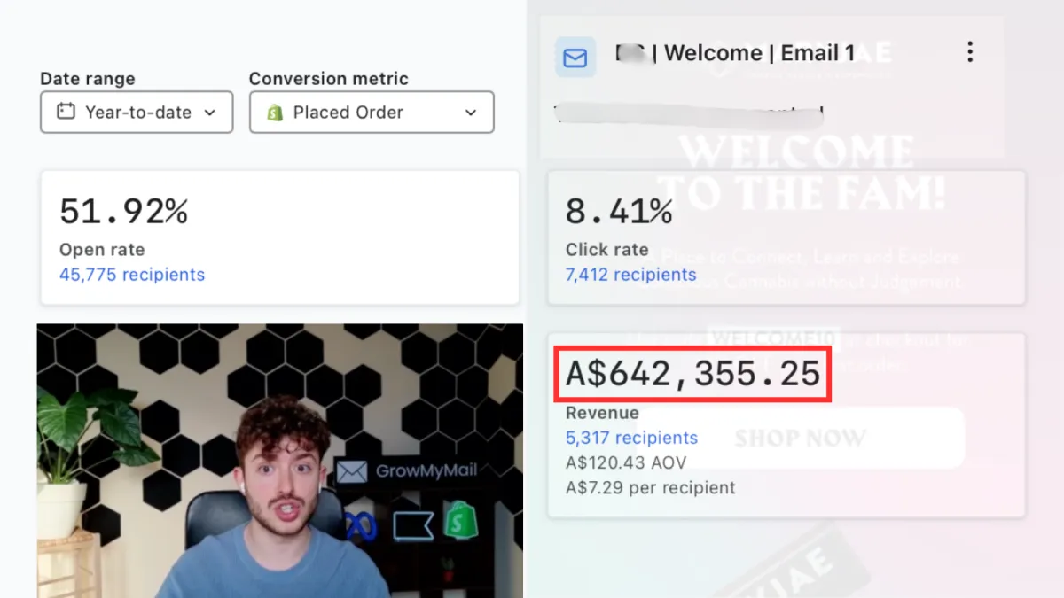
The Welcome Email Template That Generated $640,000 in One Year (And $40,000 Every Week)
Most welcome emails look great and do nothing.
Big hero image. Brand story. Discount code buried halfway down the page. By the time the subscriber finds it, they've already moved on.
In this post, we're breaking down the exact structure of the first email in a welcome flow that generated over $640,000 for one of our clients this year — and consistently drives around $40,000 every single week. This isn't theory. It's a tested, repeatable template we use across our 7 and 8-figure brand partners that produces 50%+ open rates, 8% click rates, and 6% placed order rates.
We're covering email #1 only in this post. The rest of the sequence will be covered in a follow-up.
Why Most Welcome Emails Don't Convert
Before we get into the template, it's worth understanding why the majority of welcome emails underperform. The core problem is that most brands design their welcome email like a brochure — prioritising how it looks over what it needs to do.
The subscriber just gave you their email. They're in a buyer state. They want one thing: the discount or freebie they were promised. Every second they spend looking for it is a conversion you're leaking.
The most common mistake — seen in 80–90% of brands — is having no CTA above the fold. On mobile, which is where most emails are opened, the subscriber sees a large image and a brand name before they see anything clickable. Most of them never scroll further.
The Non-Negotiables Before You Build Your Welcome Flow
These are the foundational settings and rules that need to be in place before anything else:
Turn off double opt-in. Every extra confirmation step between sign-up and your first email is a subscriber you're losing. In Klaviyo, go to your email list → Settings → Consent → Opt-in, and switch to single opt-in. The same setting exists in Mailchimp and most other platforms.
Send email #1 immediately upon sign-up. This is non-negotiable. The subscriber remembers who you are and why they signed up in this moment. Don't waste it.
The sequence needs to be at least 3 emails long, spaced one to two days apart. Each email should remind subscribers of the welcome discount. Include at least one text-based email — this is something most brands skip entirely, and it consistently outperforms for our 7 and 8-figure partners.
Always include a last-chance discount email at the end of the sequence to capture anyone who hasn't converted yet.
How to Build Your Welcome Flow Strategy Around Your Customer
Not every welcome flow should be the same length. The right structure depends entirely on your product and your customer's buying behaviour.
Ask yourself: is this an impulse purchase, or does the customer need time to decide? A skincare brand with a $15 product needs a different flow than a supplement brand with a $90 bundle.
Some brands need 3 to 4 emails. Others need 6 to 8. The key questions to think through are: what are the customer's main objections? What do they need to know before they buy? What makes your brand different in the briefest way possible?
The general structure for email #1 is consistent across brands. Everything after that should be tailored.
The Exact Email #1 Template (The Structure That Makes $40K a Week)
Email #1 has one job: deliver the incentive and get the click. That's it. Not your brand story. Not your values. Just give them what they came for and make it impossible to miss.
The template has three sections:
1. Hero section — discount code, CTA button, and a brief one-sentence intro. This is everything that needs to appear above the fold. The discount code should be impossible to miss. The CTA button should be right there alongside it.
2. Bridge section (optional) — a quick brand summary. One or two lines maximum. Chamberlain Coffee, for example, skips this entirely and goes straight to products. It works either way.
3. Product section — your best sellers or top categories. Simple grid layout. Each product links directly to the site.
That's the entire template. Simple, clean, mobile-first, and built around one goal: getting the click.
The #1 Mistake Brands Make Above the Fold
This is the single most common issue we see when auditing welcome flows. The brand puts a large hero image at the top — often with just a "Welcome to [Brand]" headline — and the CTA doesn't appear until the subscriber has already scrolled past it.
On mobile, this is fatal. Most subscribers will not scroll below the fold on a welcome email because they're in shopping mode, not reading mode. If they don't see the discount and a button immediately, they close the email and go back to browsing.
The fix is simple: your discount code and your CTA button both need to be visible the moment the email opens — before any scrolling required.
Why This Sequence Actually Works — The Psychology Behind It
There are three reasons this template converts consistently:
1. Timing. The email fires immediately after sign-up, while the subscriber still remembers exactly why they signed up and who you are. Strike while intent is high.
2. It removes friction. One CTA, repeated consistently throughout the email. The same destination every time. No choices to make, no thinking required. The design makes browsing easier than deciding. The subscriber opens the email and already knows what to do without reading a single word.
3. The trigger-action-reward cycle. You promised a discount → they signed up → they're getting it immediately. That fast loop builds trust and drives action in the same moment.
Practical Tips to Squeeze More Out of This Template
A few additional optimisations worth implementing:
Embed the discount code directly into the CTA button so it auto-applies at checkout. Wherever the subscriber clicks on the email, the discount is already waiting for them at checkout — zero friction between the email and the purchase.
Keep all CTAs consistent. One destination, one button style, repeated. Multiple different CTAs create decision fatigue and lower conversions.
Add a whitelisting request if you have deliverability issues. Include a line asking subscribers to add your email to their contacts. This sends positive signals to Gmail, Yahoo, and other email providers and reduces the chance of landing in spam or promotions.
Optimise for mobile first. Design your email at mobile width before you worry about desktop. Most of your subscribers will open it on their phone.
Key Takeaways
Turn off double opt-in — every extra step leaks subscribers
Send email #1 immediately upon sign-up, no exceptions
Keep the discount code and CTA above the fold — if they have to scroll, you've already lost most of them
The template is three sections: hero, optional bridge, products — nothing more
One CTA, one destination, repeated throughout
Embed the discount in the button so it auto-applies at checkout
Design mobile-first, every time
This structure consistently delivers 50%+ open rates, 8% click rates, 6% placed order rates
The welcome email is the highest-intent touchpoint in your entire email programme. The subscriber just raised their hand. They want what you're offering. The only way to lose them is to make it hard to find.
This template isn't complicated. It's simple by design — because simple converts. We've tested it across dozens of DTC brands at every revenue level, and the results are consistent every time.
Want the full template with real brand examples and a video walkthrough? [Click here to grab it for free] or visit growmymail.com to find out how we can build and manage this for your brand.